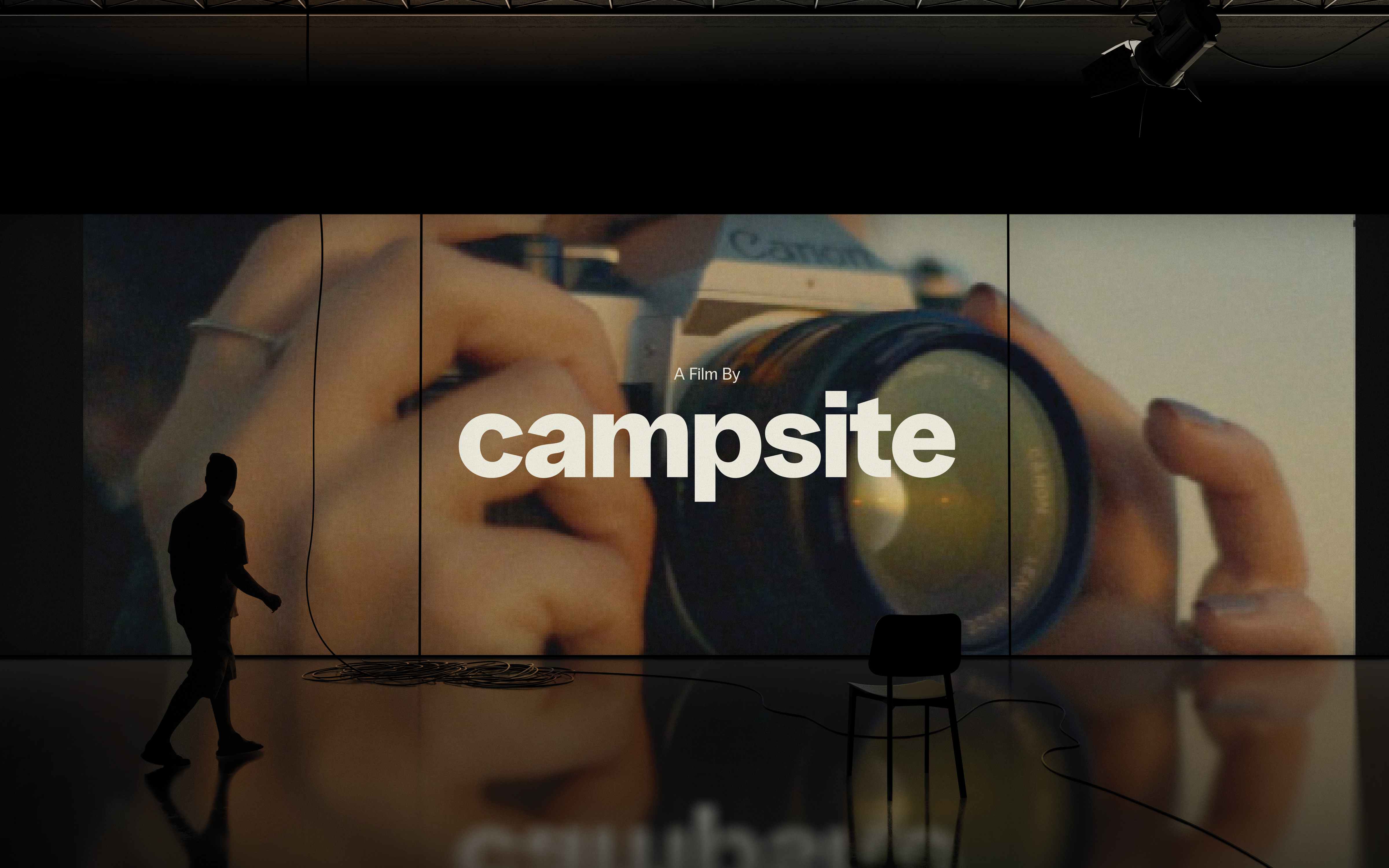
Campsite Studio
A studio rooted in essentials


Director and photographer Jesse Hunt believes in keeping the creative process as simple as camping: prioritizing the essentials, focused on efficiency, and done only in the company of good people. These became guiding principles when Jesse went to open his studio and create a brand with this ethos of simplicity and efficiency at its core.
The result was a minimalist brand that provides a versatile framework in which the studio’s portfolio can live and shine. The identity is driven by a single typeface, and a black and off-white colour palette that helps differentiate the two arms of the company: the creative side and the production side. Inspired by a compass, the icon of arrows symbolizes the boundless potential of creativity—accessible from any point. Just like setting up camp, creativity can emerge just about anywhere.
The result was a minimalist brand that provides a versatile framework in which the studio’s portfolio can live and shine. The identity is driven by a single typeface, and a black and off-white colour palette that helps differentiate the two arms of the company: the creative side and the production side. Inspired by a compass, the icon of arrows symbolizes the boundless potential of creativity—accessible from any point. Just like setting up camp, creativity can emerge just about anywhere.
VISUAL IDENTITY & WEB DESIGN